Long exposures, or why everyone’s talking about… reciprocity!

Well, perhaps not ‘everyone’s’ talking about reciprocity

Image

But on Saturday evening, I joined my fellow film photographers from the Melbourne Silver Mine Inc. to be part of a commission from the White Night festival (an all night long event that only half a million folks wandered into the city to see) to document the event from two superb vantage points – the top balcony of Hamer Hall, and the first floor of Transport Hotel – two great views of the Princes Bridge and environs.

Image

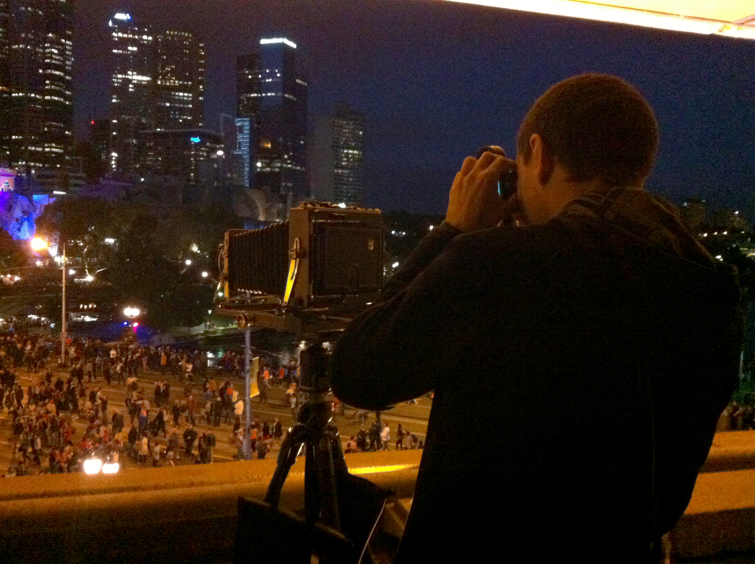
The photographic challenge of course, is shooting the city at night – and how to do that, with film, on a large format camera. Specifically, how long to expose the film? Metering of course, but… the exposures will be LONG (Large Format lenses are ‘slow’ – that is, they have small maximum apertures and don’t let in a lot of light), and film goes a bit ‘funny’ when you expose it for longer times than normal. 

Image

This funny behaviour is called reciprocity – and means different types of film start requiring more (and different) amounts of exposure when the times get longer than a few seconds. In the old days, you could puzzle over this with formulae, or by studying the behavioural graphs from the product data sheets provided by each manufacturer for their films, but now, of course, there’s an app (several in fact).

So I set up my trusty 5×4″ field camera, and used a spot meter to make a series of light readings of the highlights and shadows in the frame that I wanted to end up on film, then pressed the magical ‘average’ button to get an mid-tone exposure for the film (in this case, Kodak TXP320, which I expose at ISO200). In daytime, that’s normally all I’d do, then I’d pick an aperture/shutter speed pair accordingly. But for these pictures I then used an app to ‘correct’ the exposure for the reciprocity characteristics of Kodak TXP320. 

This means what was metered as f/22 for 30 seconds, becomes f/22 for 2 minutes and 31 seconds. Quite a difference – but it matters, because otherwise the film is underexposed. It’s all a bit of a nuisance, but the proof is in the pudding (or the developing tank, or something). 

And then, with a steady tripod, and everything on the camera locked down tightly – the resulting snap is a treat, with the unlikely mass of people on the bridge blurred to a ghostly fog (except for select dawdlers), but the bridge and background architecture sharp and immobile (as it should be). Hurrah!

No more tears.

When I was a young tacker, my dad took umpteen photos of the family with my mum’s trusty Voigtländer Vito II, and dutifully followed the best outdoor photographic advice of the day – ‘put the sun behind your right shoulder’. The rationale for this is sound – the sun is your strongest light source, and thus effectively the Key Light, and so if you have it behind you, it will light your subject, and if you have it behind but off to the side a bit, it will create shadows, and give a better sense of depth – exactly what you would do with studio lighting. However – if you are standing there as the subject for any length of time, staring towards the sun… it’s very bright, and without sunglasses you may start crying. I am sure many in many family photos I look 85% sadder than I am (I had a lovely childhood!) due to the effects of squinting into the sun for photos.

I had always reflected upon this practice, and thought ‘there must be a better way’! Well of course there is, and it’s using artificial lighting – specifically FLASH.

Flash light (whether old school bulbs or electronic strobe) is moreorless instantaneous, which is of benefit in multiple ways:

• You don’t cry, staring into a bright light

• Your pupils remain larger – (people find larger pupils more attractive, like puppies and deer)

• For exposure purposes, the shutter speed of the camera doesn’t really affect the flash light (with caveats for synchronisation) so you can use shutter speed to control the exposure of the ambient light.

The subject of actual lighting technique with little flashguns is well covered by Strobist and other websites and books and everything, but what’s been of extreme interest to me is simply the ‘lack of discomfort’ factor, and super easiness of setup.

Image

Consider this family snap I made at Werribee Mansion for my primary school chum Kate. I knew I wanted the Mansion in shot for context, so I asked them to stand in a spot shaded by a tree, and then shot away with two flashes (one low, camera left, and one higher, camera right, and at one stop higher power than the other). The ambient light of the sun lights the background, and the family is artificially lit, and hopefully smiling at my excellent jokes, rather than crying from the sunshine.

Image

Similarly, this ‘still‘ from a little film shoot a few weeks ago, features my excellent brother pretending to plant a tree with his excellent partner – the lovely backlighting is the winter sun (a bit lower and softer than summer), and the front lighting is again from two flashes on stands. I could have asked them to go in a sunny spot, but even aside from the discomfort, the artificial lighting means almost any spot will do, and the sun becomes just another ‘lantern’. 

It will be a long while before I stop thinking this is all very cool indeed.

Lighting the Bus.

Image

One thing I seem to have been doing more and more over the last couple of years, is making photographs of art, installations, and exhibitions. Like anything, the more you do, the more experience you get, and the more active you become – but these jobs are extra-interesting because you do get involved with the content of whatever you’re shooting – which often means long, tangential, rambling, very satisfying conversations with artists, curators & others – and this means I’m so busy shooting and talking I forget to document what I’m doing for this blog. Blast!

On Saturday though, I found myself at Bus Projects in Collingwood again, shooting for the gallery’s own documentation of their current exhibition. And this time I DID manage to squeeze in a setup shot so I’d have something to chat about here. 

The brief for these photos was to provide wide (literally wide) shots of the work in the gallery space context, and also some detail shots to augment these.

Bus Projects’s current home is a nice white-walled space that lends itself very well to being artificially lit – which I LOVE doing because I can control the quality of the light: general illumination, white balance, shadows, relative intensity to other/existing sources and so on. 

My standard kit these days is a bag full of little eTTL flashes with eTTL radio triggers. These are very useful because you can dial the power up and down relative to anything, and they sync with the camera shutter at high speeds, so you can balance their output against DAYLIGHT as well (simply by using the shutter). In a space with white walls, the very room is a light-modifier – so I spend my time in these shoots happily bouncing lights off the ceilings and walls, to flood rooms with light in a way that makes sense, and so you can see everything. With gels, you can colour balance them to anything as well, or ADD colour (as per the last post).

Image

In this setup picture, you can see a work called Surface Noise, ‘Featuring albums and audio works by Eugene Carchesio, Alex Cuffe, ∑gg√e|n, Lawrence English, HAPPY COOL, Benjamin Kolaitis, The Histrionics, and Darren Sylvester.’ It’s a large table in a white room with large windows, and video screens on the walls. Without the artificial light (my flashes), the daylight from the windows dominates, making the opposite side of the table quite dark. The flashes bouncing off various surfaces bring up the room light and eliminate difficult shadows, whilst making daylight seem ‘real’, and the video screens still visible (a shutter speed of around 1/15th second, f/6.3 and ISO 100)

This involves a combination of experimentation, knowledge of equipment/experience, careful placement/hiding so your lights/reflections aren’t in the shot, and a good sense of what you actually want to end up with in the end. The more you do, the better you get, but like with hair, everyone has their bad days too. My most annoying practice has to be routinely forgetting to turn the radio triggers OFF at the end of shoots – typically the on-camera radio which of course has the pricey watch battery in it. Grr – I need to put post-it notes on my hands or something…


Book shootin’

In November last year, back when it was warm and relatively sunny (remember those days?), I was invited to make some photographs for an RMIT book – ‘Designing the Dynamic‘ – a collaboration of various super-clever researchers ‘…from architecture, boat design, industrial design, mathematics, aerospace, structural engineering and computer science to explore the design and representation of dynamic systems’. In short, a satisfyingly weighty tome contributing new ideas to sailboat design (amongst other things). So the brief was to photograph some of the design models used in research for essays in the book, with a view to providing some good illustrative content, if not the cover!
So with that in mind, I trotted up to the shiny new RMIT Design Hub building, to set up a makeshift studio, and photograph some of the work with a view to editorial use – so illustrative rather than documentary.

Designing the dynamic - back
Given something of a free creative rein in this regard, the first thing that struck me about the array of models constructed to test airflow and aerodynamics, was that in operation, with fans blowing, sensors ‘sensing’, and sails responding to airflow – they would be quite dynamic… However, catching the sense of that life and movement in a static two-dimensional picture is another kettle of fish entirely. So I thought to treat them as ‘performance’ instead, and use colour to infuse a theatrical dynamic into the pictures.

Designing the dynamic - setup
The setup was a simple four flashes on stands: a ‘key’ off to my right with my biggest umbrella – for soft detail lighting. A ‘fill’ to my left and further back, to reduce the shadow contrast from the key, and two backlighting flashes with COLOUR. I used a combination of BLUE and YELLOW gels (either gaffer-taped or in a holder) on the flashes to give the blank ‘arctic white’ background a better sense of space, AND to feature light the models. I was sensitive to leaving a bit of negative space in the pictures as well, for text and barcodes and other book-stuff – and I think the colour helps to give those areas a bit of pictorial purpose as well.

Designing the dynamic - front
With the closeup of the sail used for the cover of the book – the blue light gives much better contrast to what is a white sail on a white background. My fancy is that this is how it would look at sea, if the model maker were brave enough to take it out there. The book designer (Sean Walsh Graphic Design) has (hardly cropped at ALL, and) used a BIG YELLOW STRIPE for the subtitle text on the cover too, which is nicely sympathetic to (the big yellow electrical clip on the very frame of the photograph, but also) my lighting. Thank you!!

Designing the dynamic chapter pic
Similarly, as you can see in the last photo (used in the book in a two-page chapter spread), the YELLOW backlighting is placed to stream through the plywood ‘airflow grid’ – which behaves like a photo grid in a fancy photo studio, breaking up the light into directional boxes, and not-at-all-evenly (because there are fans inside blocking some of the light), which makes the object come alive visually, rather than looking like a plywood box (which it is, but it’s also more!) The chair in the setup pic for this was for me to make a series of extreme closeups of the lasercut components of that model, and to my delight, those pictures are used liberally throughout the book as well.

Look at those books!

Best of all, the book is LARGE and coffee-tabley, and there was champagne at the launch. More of this please.

Stomping around Japan… with cameras!

Torii at the Itsukushima Shrine, Itsukushima

In June/July this year, I used up some long-service leave to go overseas again, and having completed moreorless the ‘Scandinavian set’ (except Greenland.. sorry Greenland!), headed first to Japan, where I’d never been before! Lots of people I know have been to Japan, but I think it’s fair to say that nothing they enthusiastically told me about the country really ‘gelled’ in my head until I actually got there. I’m sure this is a common experience.

In any case, this blog isn’t the place to cut & paste the 48 page ‘travelogue’ I wrote whilst wandering (well, it’s interesting to ME!!), but to chat about photographing in Japan, esp. with film and Large/Medium format cameras.

This year, in a break from the past, I took a Medium Format rangefinder as my day-to-day stomping camera – specifically the Fuji GW680III (circa 1992) – described as being a platform to support one of the sharpest lenses ever, it sports a really nice bright rangefinder and Fuji’s super 90mm f/3.5 EBC lens. My theory was that it would be faster to focus and thus make pictures, had a bigger frame area (for enlarging & cropping later), and looks like a regular camera (from a distance), so it wouldn’t draw much attention. This plus 100 rolls of the strangely inexpensive Fuji Neopan Acros 100 film, and I was all Fuji-ed up (and all Japanese, which seemed appropriate).

Fujikawaguchiko

The other camera was my standard Wista 5×4″ field camera kit, with 65, 135 & 300mm lenses, for pictures of super quality when there’s more time to pause and ponder. For this I brought along 200 sheets of Kodak TXP320 (my favourite).

In terms of getting all that film there, I squish it all into my carry-on backpack to avoid the ruination of the high-power check-in luggage x-rays. So far I’ve never had a problem with fogging, over-enthusiastic customs or anything). This trip no-one was interested in either camera (although the rangefinder was looked at in Europe later on). In fact, no-one in Japan really noticed either camera until I went into the Fujifilm museum in Roppongi (Tokyo), and the fellow there grinned and said “Nice camera!”, which was an affirming moment, esp. as they had one in their display. But it does say something about Japan’s camera culture because I never get away with that level of unintentional stealth here.

Harajuku

One thing that quickly became apparent was my optimism in bring only 100ISO film for wandering around. It turns out late June is bang in the middle of the rainy season – so a lot of the time it was rainy (but pleasantly warm) and quite dark (from a 100ISO point of view). So, I ‘had to’ periodically visit various camera shops in Kyoto & Tokyo to buy 400ISO film (Kodak T-Max & Tri-X). The two Japanese camera megastores (BIC Camera & Yodabashi Camera) still have very well stocked, large film & paper refrigerators, with the Yodabashi Camera precinct in Shinjuku (Tokyo) dedicating an entire shop to film & paper, with a lab above. They also had a well stocked medium & large format camera section, where I spent some time drooling. Film in Japan is only a little bit cheaper than in Australia, and more expensive than the US, even for Japanese film. They had so much stock and variety though, I felt quite overwhelmed. I didn’t process any film over there, but it struck me it wouldn’t be that hard to do, especially if you were shooting with faster film and were worried about x-rays as above…

Tokyo Sky Tree

Wandering around with a camera was never a problem, with the only restrictions being the inner bits of specific temples. Setting up a tripod was often restricted in temple (and other touristy) areas (but not always). Because of that I made less Large Format pictures and more Medium Format ones – c’est la vie! In addition, I have never specifically set out to be a ‘street photographer’ in the stylised observational sense, but it is rather easy to make observational photos of people going about their every day life in Japan – and I think a number of factors lend themselves to this – camera culture being one, and the sheer volume of people doing interesting/industrious things being another.


Not so quiet… except for here.

Well, it’s certainly been a few months since I’ve posted anything – and that’s not for want of activity – with regular photographic adventures, including a six week jaunt overseas (complete with multiple film cameras). So I’d best get back to it!

Starting with a brief ‘hooray’ about having a photo published in (architect & broadcaster) Rory Hyde‘s new book: ‘Future Practice: Conversations from the Edge of Architecture’. A little b&w reproduction a picture previously published in ‘Landscape Architecture‘ magazine, but possibly the first picture of mine that you can buy (in someone else’s marvellous tome) on Amazon.

This was the previously published version in Landscape Architecture. The photo Rory used is at top right.

It’s the little things.

I have written up a giant blog entry on my experiences stomping around Japan and making pictures – I just need to populate it with hyperlinks and snaps – and then I’ll post it forthwith.

No lens at all – taking the Harman Titan out for a whirl…

A few weeks ago, I succumbed to the worldwide hysteria surrounding Ilford Photo’s release of their handy dandy new Large Format pinhole camera, and ordered one directly from the manufacturer – Walker Cameras. This is a bit of a technological departure for me – consisting of little more than an ABS plastic box with a tiny hole at one end, and space for a double darkslide at the other. There are no controls for anything, only a lenscap and a bubble level on two sides. How can such a device do anything?
Here’s my first go…

This is a pic of Ballarat’s tram museum, from a few metres out the front. Here’s the workflow:
1. Look at the weather. In this instance, it was ‘kind of sunny’.
2. Spin the pointer on a (supplied, but you have to assemble it) paper wheel to sunny – well, it says I need to expose the film for 8 seconds or so.
3. (with darkslide inserted) Remove lenscap for moreorless 8 seconds
4. The deed is done
So far… I don’t actually feel like I’ve done anything except point a plastic box at a shed and remove the lid. This compared to the faffing around I normally do to make a photo… Then the ‘worst’ thing happens – I get ‘STUCK’ in the tram museum chatting happily to very knowledgeable tram museum folk, who take me out the back to have a squiz at partially restored trams. This isn’t good – it’s like a happy vortex of tram factoids, and I’m not going to make any photos am I? Well, whilst I’m chatting, I vaguely point the tripod at the middle of the tram shed and remove the lenscap for a minute or so, producing this:

Later, when I get home and process the film, I’m astonished to (a) find there’s anything on the film at all, and (b) I’ve actually made two interesting pictures. The tones and exposure are pretty good, and very printable, and even though the pictures are really soft – everything is in focus – which is because the tiny hole (“pin” hole) has an aperture of f/206, which is rather small. I feel less cheated by the experience, but it’s still pretty jolly weird using a Large Format camera that actually doubles in weight when you put the double darkslide in the back.
Next weekend, on a trip to Noojee, I tried making the classic waterfall shot (of the Toorongo Falls), whereupon a long exposure gives the water that milky effect. So I pointed the plastic thing vaguely at the waterfall (in portrait orientation), levelled it, and exposed the film for a minute or so, frowning at the vibrations I could feel under my feet from the wooden platform I was standing on. The result was this:

Again, this is alright, isn’t it? During the same trip, I was making snappy large format pictures with the Wista, and sharp sharp Nikon lenses also – and I just can’t help loving them more… but it is a real eye-opener, and sort of refreshing that you can make decent pictures with something so darn simple. Hooray Ilford, for getting me (and a 1,000 others) enthused about another film photography tangent.

Shooting the tennis like it’s 1986 (and colour film hadn’t been invented either)…


Last month I was lucky enough to get (for christmas!) a ticket to the Kooyong Classic again, which I can walk to from home – and unlike other years where I’ve taken some sort of medium format photo kit, and made strange shots of the crowd and bits of furniture – this year I brought along a useful kit of sorts, at least insofar as capturing some of the actual activity on court!

The platform of choice this time was the wonderful Olympus OM4t – the last in a line of innovative 35mm SLR’s that are super small and light compared to their modern-day equivalents, with large bright viewfinders and excellent metering. I took along a couple of lenses, but the one I was keen to test (and used most) was an Olympus Zuiko 300mm f/4.5 prime lens.

This kit is quite lightweight, even with all that metal (the OM4t has a titanium shell, and is a charming ‘champagne‘ colour). Focusing is all manual with a split diopter in the viewfinder – and so with sports, you really need to pre-empt the shot you’re going to make. To make things easier – I used Ilford HP5+ film, with an ISO of 400 – so in bright sun, I could shoot almost everything at the fastest possible shutter speed (1/2000th second) to eliminate my own movement, and to capture things like fast racket swings. With 300mm, even halfway up the stands, I was still getting a decent head-to-toe shot of either player – and with a 2x adapter (i.e. 600mm equivalent), I was hard-pressed to get anything wider than head-to-belly button. Conclusion: 300mm is a great focal length for Kooyong, and probably many other sports where you’re not miles away, and the light is good!

Because I mostly shoot Large & Medium format, I often find it hard to actually get through the 36 exposures on a 35mm roll in any useful time (and end up with several camera bodies with quarter of a used roll of film in them, grrr), but this time I was so engaged with the novelty of it all, I went through 3 rolls really rapidly.

That will save the economy.

A whole mess of pictures in one big happening!

The delightful gold and silversmiths from Melbourne’s Part B invited me in November to photograph their “ManJewellery” happening – ‘an exhibition of jewellery for men, displayed on live models, in a setting where men are often seen to congregate. An inner city bar!’ Before we actually headed off to the bar, I set up a mini studio with a roll of paper and two monolights, and snapped away at the various ‘man models’ the artists had brought with them – a ‘tethered’ setup, insofar as I had the shiny Canon 600D attached to a macbook via USB & Aperture software, so we all could look at the pictures as we went. My concession to my film habit was to make additional snaps on a Fuji 6×4.5 medium format camera, and the lens on the Canon was an old Olympus Zuiko 28mm f/2.8 thing from my OM kit. Everything triggered by pocket wizards and a good time had by all!!

Gabriel Anderson models for the ManJewellery happening!

http://crafthaus.ning.com/group/manjewellery

Annual absolutely EPIC Christmas Calendar Extravaganza!

Every year since 2005, I’ve embarked upon a MONSTER end-of-year project – a calendar featuring 12 prints from the preceding year of photography, reproduced for family as presents for Christmas. When I first started, the calendar was all scanned and inkjet printed,

An inkjet printed page!

but that wasn’t my thing, so in 2008 I switched to an entirely handprinted (darkroom) calendar – whereupon even the printed calendar dates were darkroom printed in an epic undertaking of double exposures for every single print (through acetate reversal transparencies).
Another inkjet-printed page from 2006's calendar

That was some serious hard work – I was making about 14 calendars, which equated to 364 exposures, not including tests, errors, changes-of-mind and so on. They were nice though – but I was binding them in a very traditional calendar style – commercially wire bound, in a style I thought wasn’t very sympathetic to the prints. Plus, the calendars were on 8×10″ paper, which with room for binding, date info and a compositionally nice border, made for a rather small print indeed – by 2010, I was ready for change!!
An entirely darkroom printed page - dual exposures for the photo and the text!!

And so, for the last two years, I’ve been making a calendar I’m really satisfied with – here’s the workflow:
1. Throughout the year, I make photos – and all the stuff I shoot on film & in b&w is up for consideration. In November(ish), I revisit all the negatives, making a list of twenty or so I reckon would be nice calendar pics – if I haven’t scanned the negs already, I do so, to make a mockup I can test various crops on, and see if I still like the pic after staring at it for a while
2. In Adobe InDesign – I mockup the printed calendar layout detail – based on a nice template I setup (with credit for the overall excellent design idea to family) last year – this will all be inkjet-printed on a slightly longer sheet of paper (from K.W. Doggett!) so that lifting up the 8×10″ darkroom print for any given month reveals the camera used and other interesting info, and the month/date info is visible always.

3. Having pondered the pictures, I narrow it down to 12 (and assign them to months) and start printing – with test prints, and fussiness – I am often only getting one print done in an evening (15 copies) – but as I get into the swing of things, I can get as efficient as two or three. Things slow down if it’s a difficult negative in terms of exposure/contrast, or I radically change my mind about composition. Throughout this – I jot very specific notes about each print in my ‘darkroom book’ just in case I have to do reprints – what contrast/lens/aperture/exposure/enlarger height etc. I try to print in a sensible order (like all the same size negatives together) rather than chronologically, so that I don’t make foolish errors (as much). That said – the last couple of calendars have only featured a few formats. This year’s was only 4×5″, 6×6 & 6×4.5cm – so I only used three enlarger lenses.
4. Around this activity, I’ve edited the InDesign doc to include specific detail for each print chosen for each month, and printed out a few drafts for proofing. I also do a bit of a digital (bah!) photo shoot of each of the cameras used for the pictures in the calendar (to include) – because I reckon that’s interesting!
The longer page underneath the print - with print info and the camera used!

5. When everything’s printed – then comes the tedious part of assembly, with family assistance(!!) – lots of ouchy hole-punching and careful assembly – then wrapping up in jolly christmas paper and gleeful distribution.
The cover page for this year and last year!

What do I enjoy about all this? Well – all my extended family now have my photos hanging up in their homes – with the print changing every month. Additionally, having done seven of them now, they are really evolving into an interesting sort of ‘personal retrospective’, whereupon I can reflect back on, not just the previous year of life and photography, but the previous seven years – it’s very interesting, and I’ve already done the hard work of sorting out the good stuff! Even looking back through them to write up this blog entry, I’m rediscovering stuff. I hope I have the motivation and content to keep churning them out for many years to come!